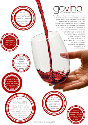
I think this silver award winning product solves alot of problems of having quality fine wine experiences where its not possible. but mostly it solves the problem of wasting disposable cups as this wine glass is reuseable and 100% recycleable. and overall it really changes the image of "plastic" of being a poor and unstable material.
analysing the visual element of a product can really make a difference in a design being good or bad reguardless of the function. if a product looks bad then it is really hard to persuade people to buy it.
Very attractive and clean poster design. I like how you stuck with the red and white colour scheme. It brings out the colour of the wine in the glass and the circular shape which contains your text, is in harmony with the organic, smooth form of the glass. Very nice :)
ReplyDeletei like you poster a lot . It is simple but sooo attractive . The glass, hand and wine are connected and done in the right size , so it fits into the poster and engages viewer so much
ReplyDeleteI like the way u put text into circles with short and effective words( as most of people do paraghraphs in square box , thats boring :(( ) ... Anyway i like yours.
good job Jennie